 Nina Fowler was born in London in 1981. She graduated with a first in sculpture from Brighton University in 2003. She was nominated for the BP Portrait Prize 2008, Shortlisted for the Jerwood Drawing Prize 2010 and more recently, shortlisted for The Young Masters Prize 2012.
1. Do you come from a creative family?
Yes, my father is an architect. He is always my first point of call for advice on how to construct something. He has a way of designing/building things, which is always elegant and simple. He uses materials economically but with great style and practicality. My mother is a clothes designer and for me, her taste is impeccable. Like my dad she has a way of seeing beauty in things, which I am still learning from. They have always been the biggest supporters of my work. Dad even took me to see Hollywood via Elvis’ home, ‘Graceland’, when I was 16 and already fascinated by the legacy of both. Although my brother wouldn’t describe himself as creative he has also had a great influence on me through his knowledge of music, always steering me in the way of songs and artists that have been inspirational. My boyfriend Craig Wylie is now a constant source of creativity as he too is an artist – one that I will always hold in much higher esteem than myself – so to him I go for advice and we enjoy a mutual love of art in our lives.
2. What inspires you most about the films you work from?
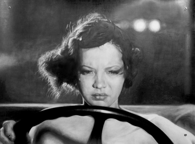
I am inspired by momentary flashes within films. The films I tend to find these flashes within are mainly pre-1950. I like to follow a trail of films which I read about in books, online or in reference to a particular actor/director/era, so I can go from watching a mainstream classic to an obscure pre-code film. I find inspiration in the composition of a shot or emotion which is powerful enough to hold its own when taken out of context and turned into a pencil drawing. Sometimes I like a particular still frame in a film because an actor running across a set becomes a dance move or a twisted abstraction, which can be eloquently captured and heightened in a drawing. Sometimes it is simply the brilliance of a story or script which inspires me to seek out a character or action in a film to use somewhere in a work one day.
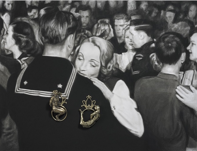
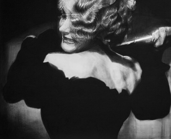
It’s difficult for me to pinpoint what inspires me most but I imagine from an objective viewpoint it is very easy – lots of frustrated women and bleeding men! I tend to go from series to series as I am inspired and every now and again I step back and think about the themes that run throughout them. Last year I was very much inspired by Marlene Dietrich and she became a symbol of defiance, magnitude and power in the works. In 2011 I was enthralled by Kenneth Angers take on Hollywood and followed his path downwards into the underbelly where I became very involved with the ‘dark-side’. Before then I embarked on a major project which involved the silent film star Rudolf Valentino and I found inspiration in the furor surrounding his death. I guess I am inspired by the actors and actresses that are silent to us now but are still symbolic of todays epidemic of celebrity obsession – they are just far more appealing to me to draw and sculpt.
3. Do you think colour would add or take something away from the work?
I have dabbled in colour. I am a big fan of Manet and his use of black alongside subtle colour. A portrait I did of the dancer Carlos Acosta, in which I used some colour, was inspired by a painting by Archile Gorky called “The Artist and His Mother”, 1926-1936 after reading that he made the painting by re-creating the colour in his memory whilst working from a black and white image. I like the idea of applying colour to something that is colourless. Like the way that black and white photos were hand-stained before colour film was available. I also made a work called “Colour Keeler” in 2010 where I couldn’t resist the iconic red stripes of Christine Keeler’s swimming costume, I am always impressed with the technically adept use of colour pencils too as this can have a beautiful quality.
Recently I have started adding neutral colours into the background of my drawings by way of linoleum flooring. For example in my recent portrait of William Burroughs, “Bill” which is drawn from a black and white photograph taken by a friend of mine, I have added an industrial beige linoleum alongside a sparkling non-slip vinyl to the background which seemed to suit the character of the image.
My medium is pencil and therefore I mainly translate imagery, which is black and white. I have always been drawn to subtlety in terms of colour. When I watch Craig painting, I realise I know very little about colour as he seems to speak a language of colour which I cannot begin to understand, but then he knows very little about Joan Crawford!
4. The work has a hyper-realistic quality, is it important for the viewer to still see them as drawings or as stills from a movie?
I am totally uninterested by the fact that my drawings may look like photos. I have always enjoyed pushing my drawings further in terms of getting technically more and more precise but this is mainly to get rid of the discussion of how much they look like a photo. Once they are finished I hope then the viewer can focus on the subject. Having said that I still see them entirely as drawings otherwise they would be totally pointless. I enjoy drawing in simple lines too. I have been amassing a series of drawings over the years that I call ‘tracings’ the unconscious marks left on pieces of tracing paper I have used, where the subject is almost entirely eradicated. I appreciate that the hardest drawing to make successful is a simple line drawing. I just love to keep going until my subject is undeniably there on the paper.
5. What does drawing add to the atmosphere to a piece over a photo?
I never work from one photograph alone. I collage several stills together to make the optimum compositions for a drawing. The drawing also evolves as it is carried out so the final work can travel quite far from the original photograph it came from. Of course the drawings take on a life of there own too as I exaggerate the aspects of the subject that drew me to it in the first place. I hope to inject a sense of passion and drama which goes beyond the photo.
6. What do you feel is most lacking in current films compared to Film Noir and others of that era?
Glamour and elegance. Mystery and finesse. Nothing remains unsaid or unseen anymore. Censorship back then meant that scripts and directors had to be cannier with how they depicted tough subjects without filming them directly. My favourite era is ‘pre-code’ in the early 30’s when censorship was lax and filmmakers were getting away with a lot more than usual, drawing audiences in for the thrill. They were dealing with subjects which are still relevant today such as drug abuse, alcoholism, and adultery etc. but to my mind in a far more eloquent way.
7. Would you ever work with imagery from films of a later date, 80’s perhaps?
I do collect more recent images, certain actors hold an irresistible charm for me such as Jack Nicholson, Dirk Bogarde + Richard Burton and I have worked them into drawings. I am fascinated always by the extent to which Hollywood still holds such power over its audience and the private lives of the stars is interminably interesting for most of us. The ‘Ryan Gosling’ effect is the most recent pandemic! As a result it seems he has decided to retire from acting – we await to see the next chapter unfold….
8. Actors and musicians have bought your work. Is this a good motivator for making more work and does it help with future sales?
I enjoy the fact that my work appeals to people within those industries because I guess they are the spectators that can relate most closely to the subject and this would make them the harshest critics too. Sharleen Spiteri says of her drawing of Judy Garland: “She captures the pain and loneliness in Garland’s life so exquisitely” coming from a singer who I have always admired and who I think must experience similar emotions to create the music she does, this is a great compliment to me. In terms of sales, celebrity endorsement it seems is the best publicity anyone can have these days, other artists would probably disagree with me but I enjoy this aspect of my career because again, it is in keeping with the subject matter of the work itself.
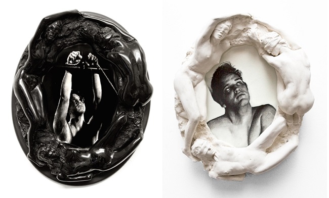
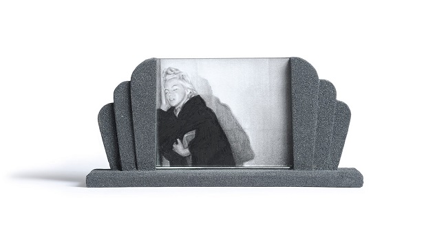
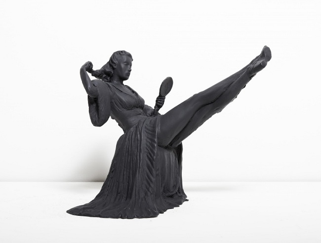
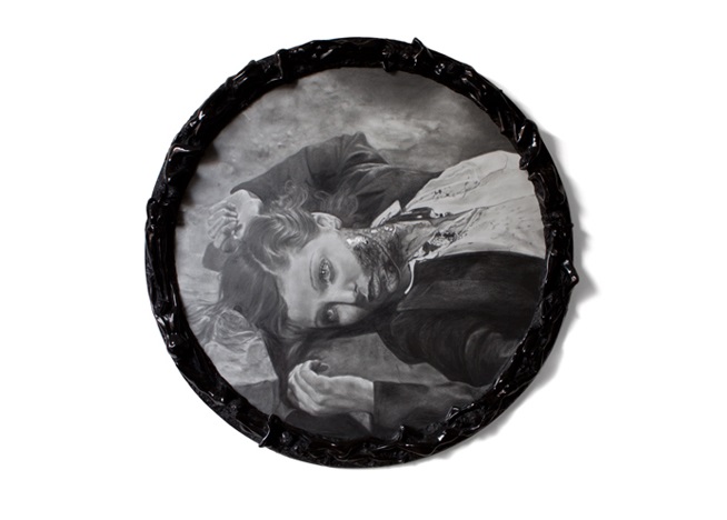
9. You often frame your work in interesting ways. What do you think the frames adds to the final piece?
As a student of sculpture at Brighton University one of the main lessons we were taught was how important the presentation of your work is. Over the years I have become more interested in finding new ways to present the work, sometimes due to lack of funds (!) and sometimes due to the work itself being particularly challenging to hang in the way I want to present it. For example, in 2009 I presented an installation called ‘Valentino’s Funeral’ which involved 3 very large drawings on paper stretching 15 meters wide. This proved impossible to frame without cutting the drawing up so I decided to hang the paper from eyelets, like the sails of a boat. This allowed the paper to hang freely on the wall and it added a sculptural element to the installation also. The eyelets have since become a trademark of the work and I always hang my drawings from them even within frames now. I love the process of punching holes through the drawing and hammering the metal hoops in, for me, the process adds a sense of power and drama to the work. I don’t ever like to be too precious about the drawings either, yes, they take a lot of time and of course they are valuable to me but I still get a thrill when I punch my eyelets through the paper as the final farewell to the finished piece.
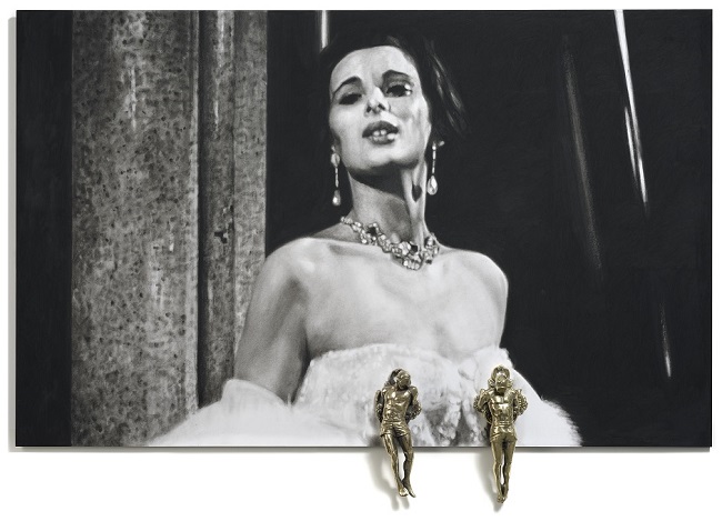
I think the framing of the works is also influenced by the joy I take in creating 3-dimensional work. The drawings are often cut out, bent or mounted so they need space to exist. I therefore need to be creative with framing. Recently I have been emulating vintage style frames in a contemporary context and in the past I have actually sculpted and cast my frames, these were made up of nude, blindfolded women encircling my drawings in various states of blind agony/ecstasy, inspired by the baroque and again hopefully adding tension and passion to the works.
10. Does the life style of ‘bad girl glamour’ appeal to you in your real life?
Ha ha! I love that question!…..and yes it most certainly does. My earliest real-life idol was Wendy James, lead singer of the 80’s band Transvision Vamp. She represented a rock and roll, bad-girl to me. From the age of seven I was emulating her style, wearing elbow length gloves with rings over the top! I am also a fan of Lana Del-Rey, for similar reasons. When I moved back to London after graduating I began working for John Dunbar who introduced me to ‘The Colony Rooms’ and its members.
I spent many an evening on Dean St, hopping between there, ‘The Groucho Club’, ‘The French House’ and ‘Jerry’s’, I enjoyed the party lifestyle for a while and all the glamour that goes with it. I am certainly inspired by the legacies of, for me, the ultimate bad-girls such as Jean Harlow, Mae West and Clara Bow, although I would always prefer to be making work about them in my studio rather than nursing a sore head! I wear a skull ring, designed by my great friends David Courts and Bill Hackett – the same ring Keith Richards has worn for 40 odd years – which never leaves my finger and is a small but potent symbol of the ‘bad-girl glamour’ lying latent.
11. Does moving into filming an original Noir film of your own interest you?
I often ask myself that question but I think I would prefer to move into set-design one day. I love ballet in particular and the silence of dance in the same way I love silent film – the gestural movement to describe a story, assisted by a beautiful musical score and stage set. I hope one day to work alongside a choreographer to create a new vision for perhaps a traditional ballet.
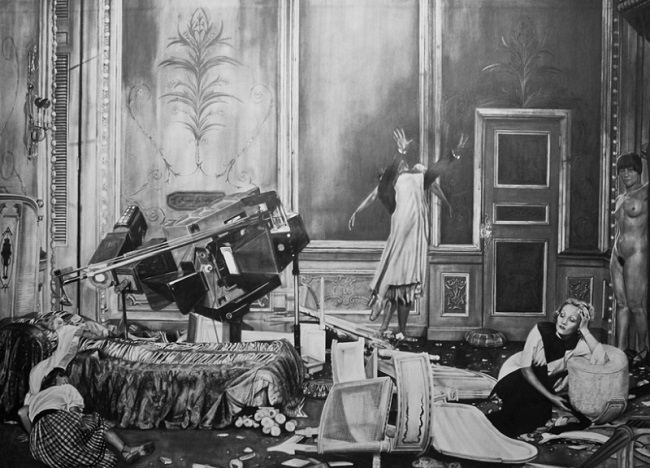
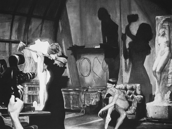
Some of my drawings in recent years have been inspired by stage sets in their scale. “A Real Allegory: Parts I & II” was an installation exhibited at Galerie Dukan Hourdequin in which the drawings were 3 meters wide and 2.5 meters high. The compositions were set in two different interiors where I placed various characters to create new fantastical scenes.
I have great admiration for film makers and I sometimes feel like I am directing in a way by cutting, splicing and collaging my scenes together but ultimately I enjoy working alone and having complete control over the outcome – not a healthy attitude for the team work involved in making a movie.
12. I love this Noir tag-line ‘A woman without a past, a man with no future!’ Are there any Noir quotes you find inspiring and get you in the mood for making work?
Too many to mention! A lot of my titles are edited versions of quotes or movie title bylines. For example one of my ‘Pre-code Series’ is entitled ‘Merrily’ which comes from the brilliant film title: ‘Merrily We Go To Hell’ (1932). I would have chosen to watch that film purely because of its title. I am constantly making notes of lines in films that inspire my work. Recently I watched a film called ‘Human Desire’ (1954) in which a line goes: “All women are the same, they just have different faces so the men can tell them apart”. I know it is wrong on so many levels but when it is delivered by an actress (Peggy Maley) of that era with such cynical coolness, for a minute you almost believe it.
Nina’s new work will be on show in ‘Strong Women’ at Neuer Kunstverein Aschaffenburg, Germany. On show from the 28th July to the 22nd September 2013.